7 jjDotPlot
The scRNAtoolVis supplies a jjDotPlot function to visualize gene expressions in an elegant way.
7.1 Load test data
library(scRNAtoolVis)

httest <- system.file("extdata", "htdata.RDS", package = "scRNAtoolVis")
pbmc <- readRDS(httest)

# add groups
pbmc$groups <- rep(c('stim','control'),each = 1319)
# add celltype
pbmc$celltype <- Seurat::Idents(pbmc)

# load markergene
data("top3pbmc.markers")

# check
head(top3pbmc.markers,3)
# # A tibble: 3 x 7
# # Groups:   cluster [1]
#     vvp_val avg_log2FC pct.1 pct.2 p_val_adj cluster     gene
#       <dbl>      <dbl> <dbl> <dbl>     <dbl> <fct>       <chr>
# 1 1.74e-109       1.07 0.897 0.593 2.39e-105 Naive CD4 T LDHB
# 2 1.17e- 83       1.33 0.435 0.108 1.60e- 79 Naive CD4 T CCR7
# 3 3.28e- 49       1.05 0.333 0.103 4.50e- 45 Naive CD4 T LEF1
7.2 Supply with genes
You can only supply gene names to visulaize gene expressions:
jjDotPlot(object = pbmc,
          gene = top3pbmc.markers$gene)
We can use celltype in the metadata to mark celltypes:
jjDotPlot(object = pbmc,
          gene = top3pbmc.markers$gene,
          id = 'celltype')
Add dendrogram to genes using xtree:
jjDotPlot(object = pbmc,
          gene = top3pbmc.markers$gene,
          xtree = T)
Rescale the gene expressions in a given range:
jjDotPlot(object = pbmc,
          gene = top3pbmc.markers$gene,
          xtree = T,
          rescale = T,
          rescale.min = 0,
          rescale.max = 1)
You can change the point shape:
jjDotPlot(object = pbmc,
          gene = top3pbmc.markers$gene,
          xtree = T,
          rescale = T,
          rescale.min = 0,
          rescale.max = 1,
          point.shape = 22)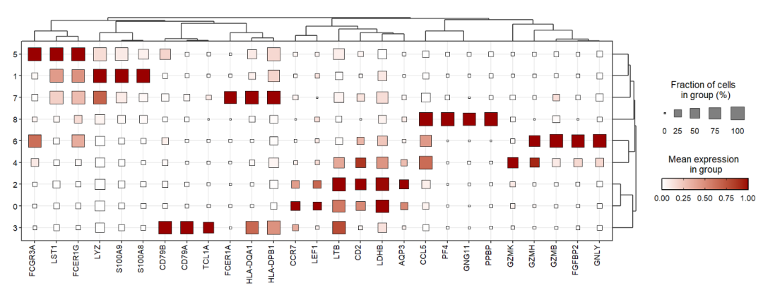
Add geom_tile instead of geom_point:
jjDotPlot(object = pbmc,
          gene = top3pbmc.markers$gene,
          xtree = T,
          rescale = T,
          rescale.min = 0,
          rescale.max = 1,
          point.geom = F,
          tile.geom = T)
Rescale to -2-2:
jjDotPlot(object = pbmc,
          gene = top3pbmc.markers$gene,
          xtree = T,
          rescale = T,
          dot.col = c('blue','white','red'),
          rescale.min = -2,
          rescale.max = 2,
          midpoint = 0)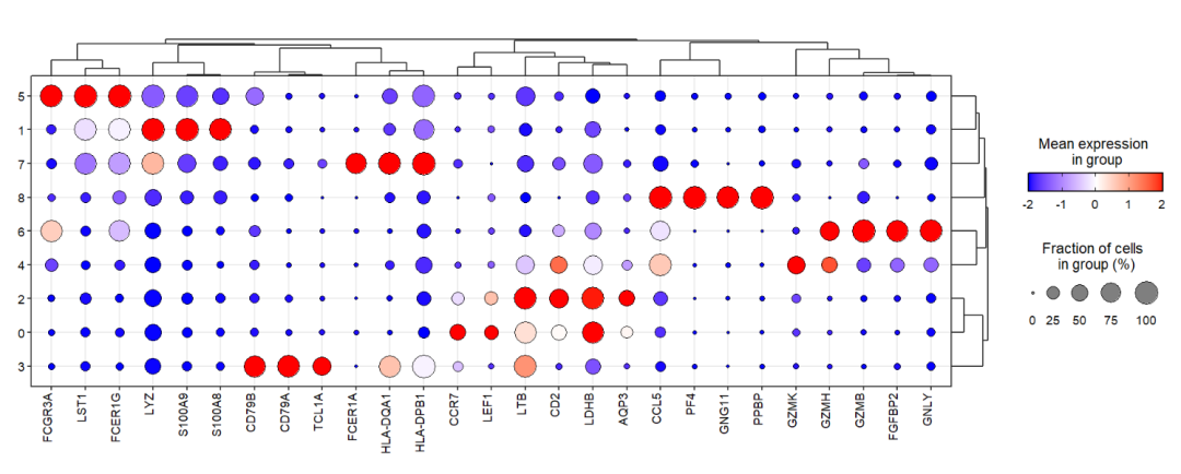
7.3 Supply with marker gene
You can supply marker genes including gene and celltype column information from FindAllMarkers to visulaize gene expressions:
jjDotPlot(object = pbmc,
          markerGene = top3pbmc.markers)
You can also add dendrogram:
jjDotPlot(object = pbmc,
          markerGene = top3pbmc.markers,
          xtree = T)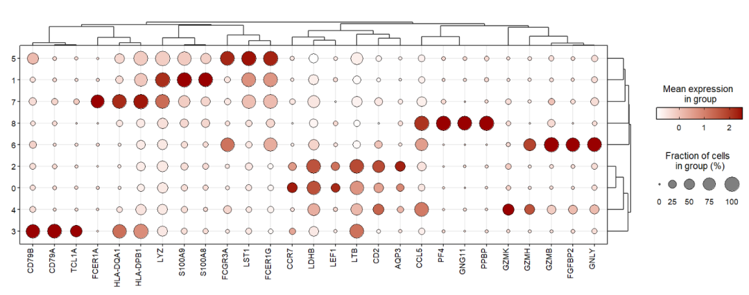
Add celltype annotations for gene:
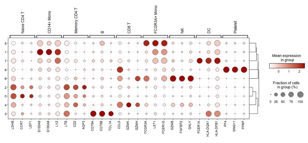
Showing using heatmap:
jjDotPlot(object = pbmc,
          markerGene = top3pbmc.markers,
          anno = T,
          plot.margin = c(3,1,1,1),
          point.geom = F,
          tile.geom = T)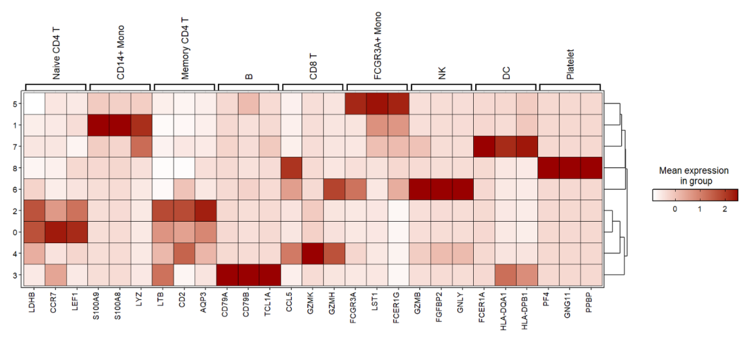
Change tree position using tree.pos and combine tree labels using same.pos.label:
jjDotPlot(object = pbmc,
          markerGene = top3pbmc.markers,
          anno = T,
          plot.margin = c(3,1,1,1),
          tree.pos = 'left',
          same.pos.label = T)
7.4 inherite annoSegment args
You can pass other annoSegment parameters to ajust annotations of jjAnno pakcage:
jjDotPlot(object = pbmc,
          markerGene = top3pbmc.markers,
          anno = T,
          plot.margin = c(3,1,1,1),
          tree.pos = 'left',
          same.pos.label = T,
          yPosition = 10.3)
7.5 Split by multiple groups
You can also visualize genes across multiple groups using split.by:
jjDotPlot(object = pbmc,
          gene = top3pbmc.markers$gene,
          id = 'celltype',
          split.by = 'groups',
          dot.col = c('#0099CC','#CC3333'))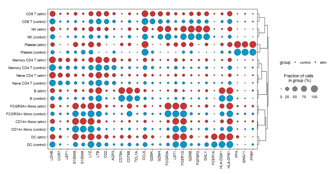
Set split.by.aesGroup = T to turn off the colors grouped by groups:
jjDotPlot(object = pbmc,
          gene = top3pbmc.markers$gene,
          id = 'celltype',
          split.by = 'groups',
          split.by.aesGroup = T)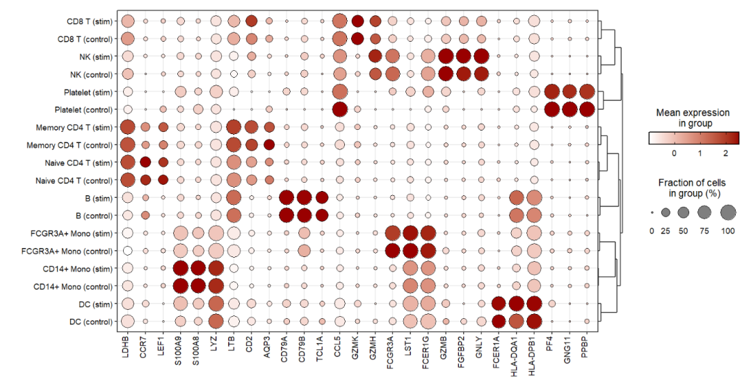
Add heatmap:
jjDotPlot(object = pbmc,
          gene = top3pbmc.markers$gene,
          id = 'celltype',
          split.by = 'groups',
          split.by.aesGroup = T,
          point.geom = F,
          tile.geom = T)
7.6 Order
Supply with your own gene or cluster orders to plot:
# change gene order
jjDotPlot(object = pbmc,
          gene = top3pbmc.markers$gene,
          gene.order = rev(top3pbmc.markers$gene))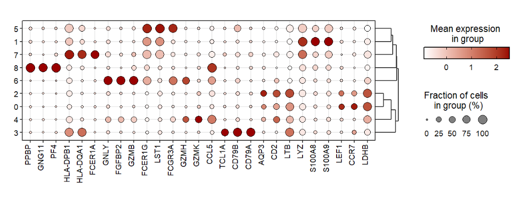
You should turn off the ytree when you change cluster orders:
# change cluster order
jjDotPlot(object = pbmc,
          gene = top3pbmc.markers$gene,
          gene.order = rev(top3pbmc.markers$gene),
          cluster.order = 8:0,
          ytree = F)