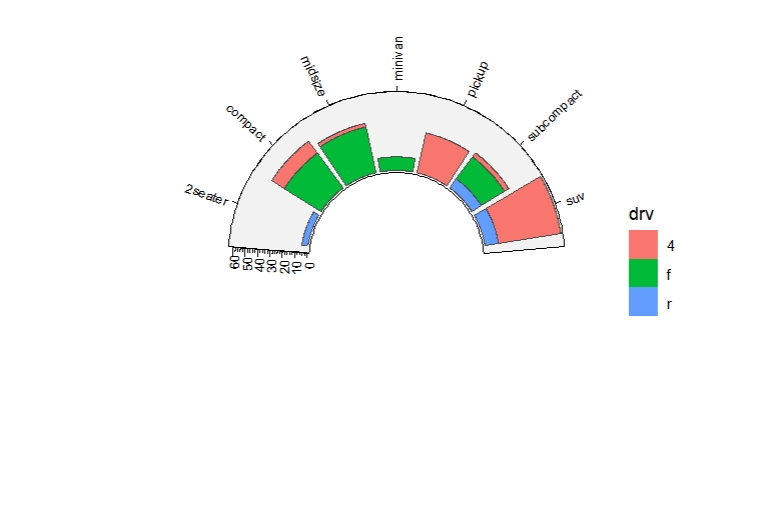
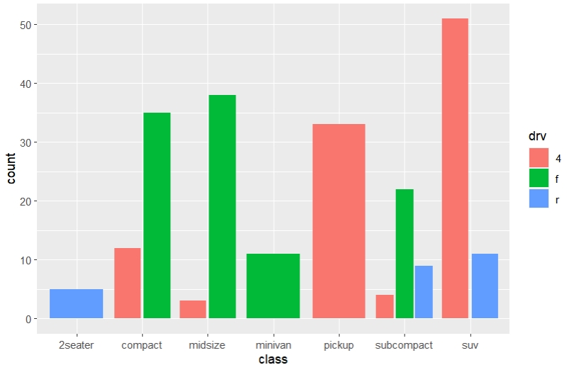
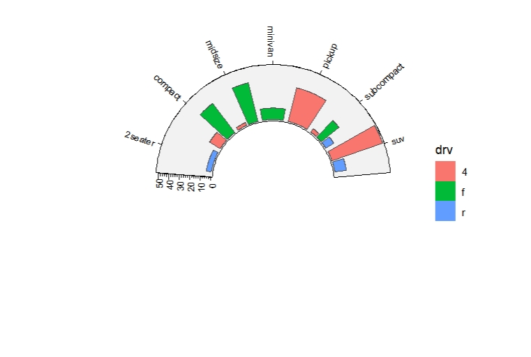
Chapter 3 Geom arc layers
Based the arcGrobs we have created, we can transform them into geom layers by using ggplot2 grammer for better visualisation. The following contents we will describe relative geom arc layers.
The basic arguments for each layer includes: start, end, r0, r1, clock.wise. You can re-specify them in each geom mapping parameters.
3.1 geom_arcpoint
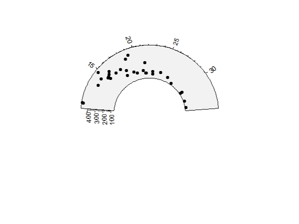
geom_arcpoint draws scatter point like geom_point.
Simple scatter point:
Mapping with colors:
ggcirclize(data = mtcars,
           mapping = aes(x = mpg,y = disp,end = 270)) +
  geom_arcpoint(aes(color = factor(cyl)))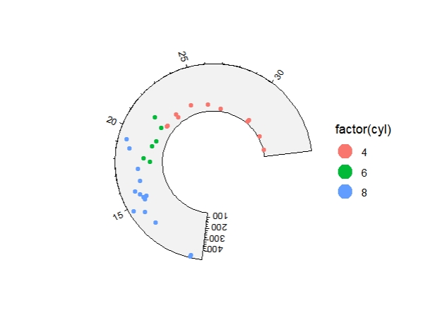
You can adjust the axis settings with yAxis.params and xAxis.params:
ggcirclize(data = mtcars,
           mapping = aes(x = mpg,y = disp)) +
  geom_arcpoint(yAxis.params = list(yscale = c(100,800)),
                xAxis.params = list(xscale = c(-50,100)))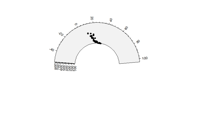
Mapping with size and color:
ggcirclize(data = mtcars,
           mapping = aes(x = mpg,y = disp,
                         color = as.character(cyl),size = qsec)) +
  geom_arcpoint()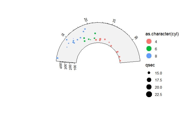
Mapping with gradient color:
ggcirclize(data = mtcars,
           mapping = aes(x = mpg,y = disp,
                         color = qsec,size = qsec)) +
  geom_arcpoint(end = 270,r0 = 0.3,r1 = 0.8) +
  scale_color_gradient(low = "blue",high = "red")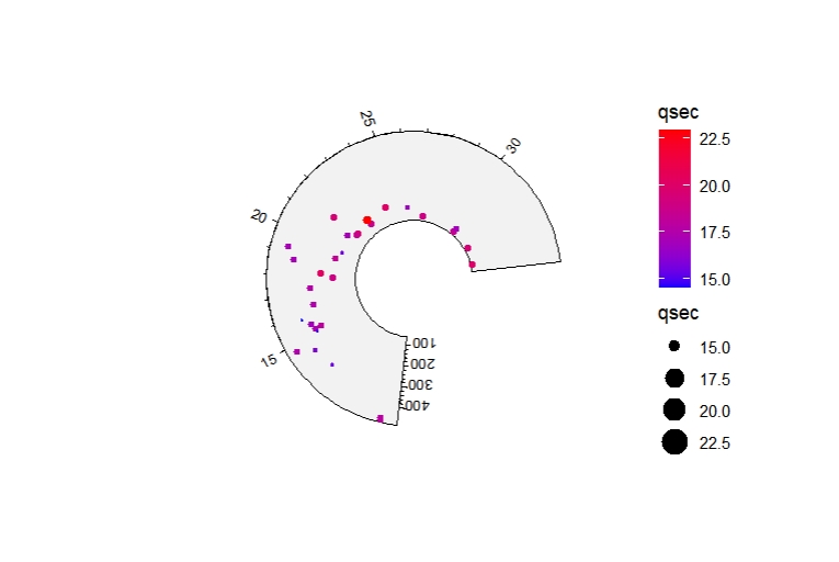
Control the background graphic settings:
ggcirclize(data = mtcars,mapping = aes(x = mpg,y = disp)) +
  geom_arcpoint(sector.bg.fill = "orange",
                sector.bg.lty = "dashed",
                sector.bg.lwd = 2)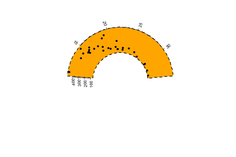
3.2 geom_arcsegment
geom_arcsegment draws segment line like geom_segment.
df <- data.frame(x = c(rep(0,4),0:4),x1 = c(rep(4,4),0:4),
                 y = c(0:4,rep(0,4)),y1 = c(0:4,rep(4,4)),
                 g = LETTERS[1:9])

ggcirclize(df) +
  geom_arcsegment(aes(xmin = x,xmax = x1,ymin = y,ymax = y1))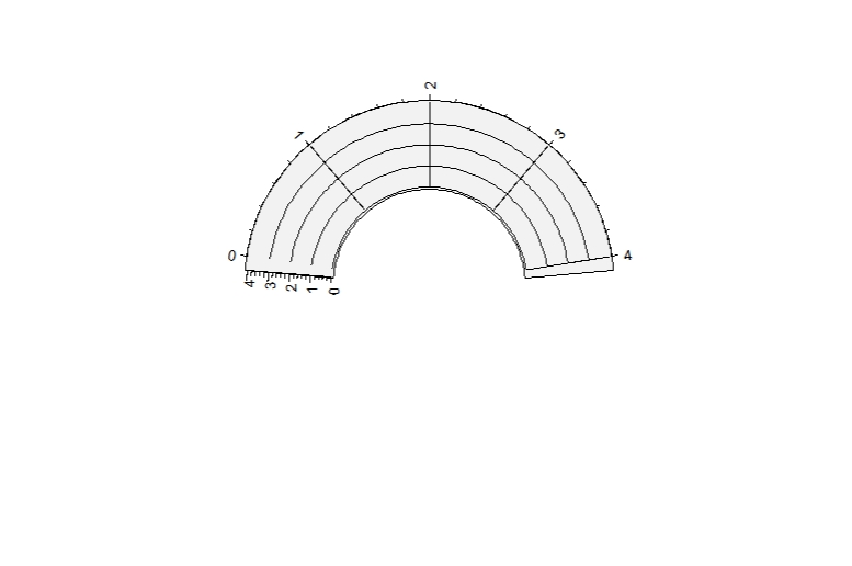
Add arrows:
ggcirclize(df) +
  geom_arcsegment(aes(xmin = x,xmax = x1,ymin = y,ymax = y1,
                      color = g),linewidth = 3,
                  arrow = arrow(type = "closed"))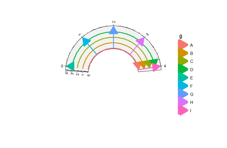
3.4 geom_arcpath
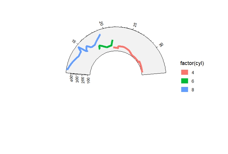
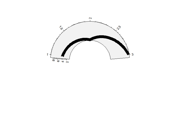
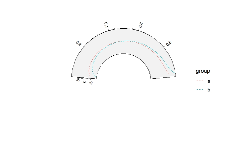
geom_arcpath draws line like geom_path.
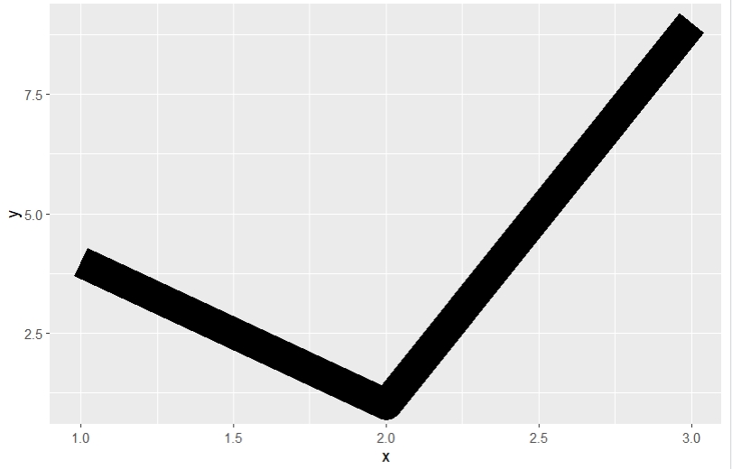
See what geom_arcpath output:
x <- seq(0.01, .99, length.out = 100)
df <- data.frame(
  x = rep(x, 2),
  y = c(qlogis(x), 2 * qlogis(x)),
  group = rep(c("a","b"),
              each = 100)
)

ggplot(df, aes(x=x, y=y, group=group)) +
  geom_line(aes(colour = group), linetype = 2)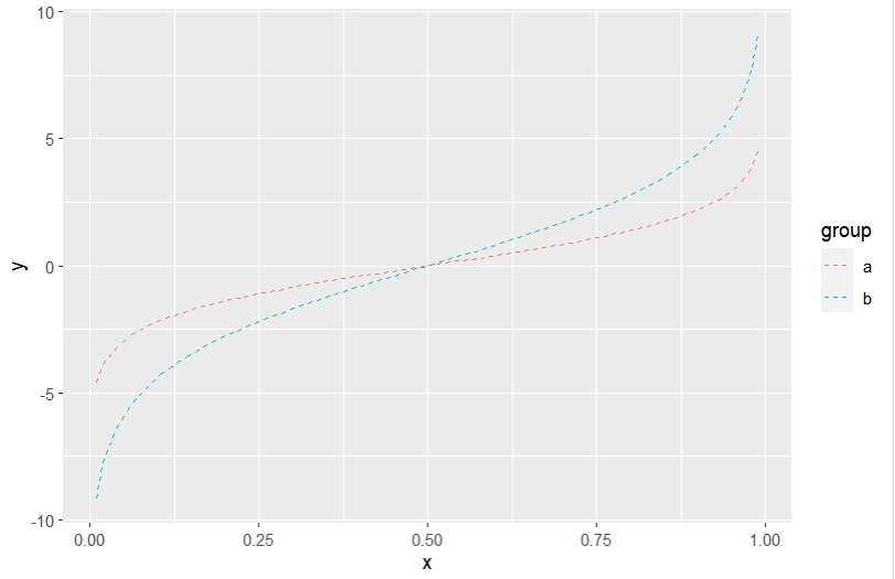
3.5 geom_arcpolygon
geom_arcpolygon draws polygon like geom_polygon.
First we see output with ggplot:
ids <- factor(c("1.1", "2.1", "1.2", "2.2", "1.3", "2.3"))

values <- data.frame(
  id = ids,
  value = c(3, 3.1, 3.1, 3.2, 3.15, 3.5)
)

positions <- data.frame(
  id = rep(ids, each = 4),
  x = c(2, 1, 1.1, 2.2, 1, 0, 0.3, 1.1, 2.2, 1.1, 1.2, 2.5, 1.1, 0.3,
        0.5, 1.2, 2.5, 1.2, 1.3, 2.7, 1.2, 0.5, 0.6, 1.3),
  y = c(-0.5, 0, 1, 0.5, 0, 0.5, 1.5, 1, 0.5, 1, 2.1, 1.7, 1, 1.5,
        2.2, 2.1, 1.7, 2.1, 3.2, 2.8, 2.1, 2.2, 3.3, 3.2)
)

# Currently we need to manually merge the two together
datapoly <- merge(values, positions, by = c("id"))

ggplot(datapoly, aes(x = x, y = y)) +
  geom_polygon(aes(fill = value, group = id))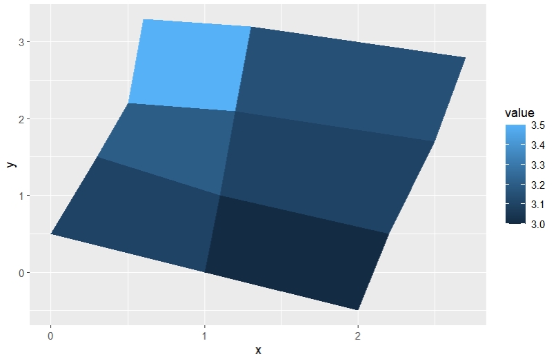
geom_arcpolygon outputs:
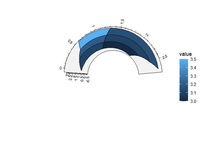
The id is used to distinguish the groups:
df <- data.frame(x = c(0.1,0.2,0.3,0.4,0.5,0.4,0.7,0.6,0.7),
                 y = c(0.1,0.9,0.1,0.1,0.5,0.9,0.9,0.5,0.1),
                 id = c(rep(1,3),rep(2,6)))

ggcirclize(df, aes(x = x, y = y)) +
  geom_arcpolygon(aes(group = id))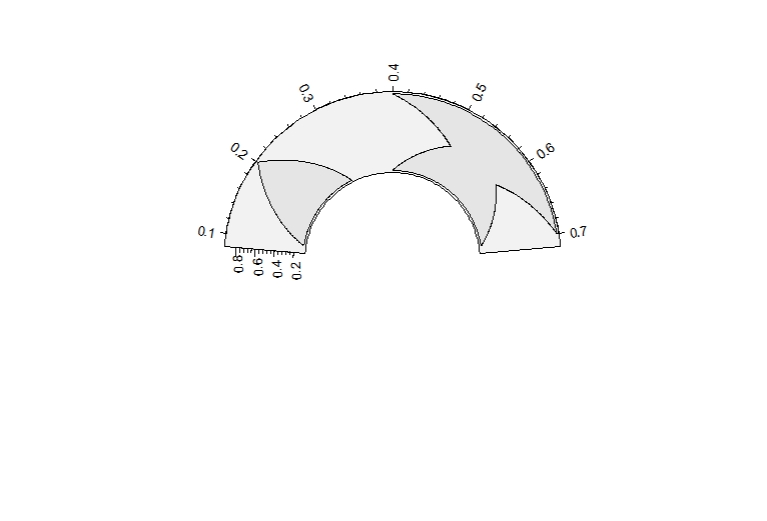
d=data.frame(x=c(1,2,2, 3,4,4), y=c(1,1,2, 2,2,3),
             t=c('a', 'a', 'a',  'b', 'b', 'b'),
             r=c(1,2,3, 4,5,6))

ggcirclize(d, aes(x = x, y = y)) +
  geom_arcpolygon(aes(id = t))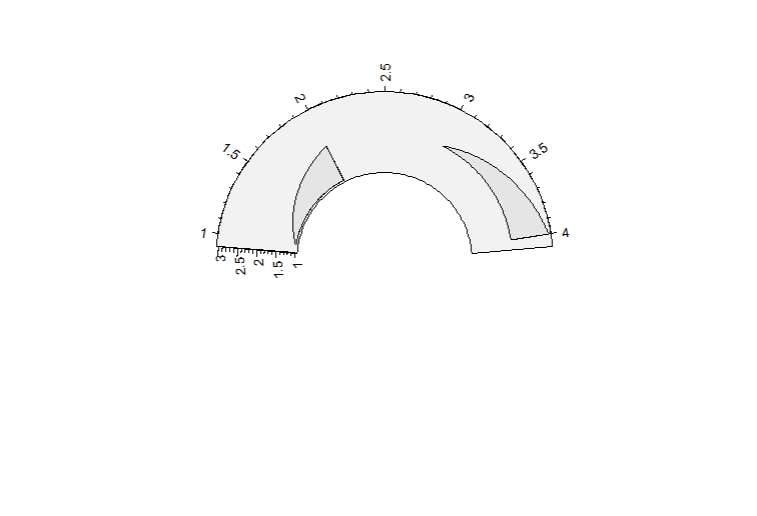
3.6 geom_arcrect
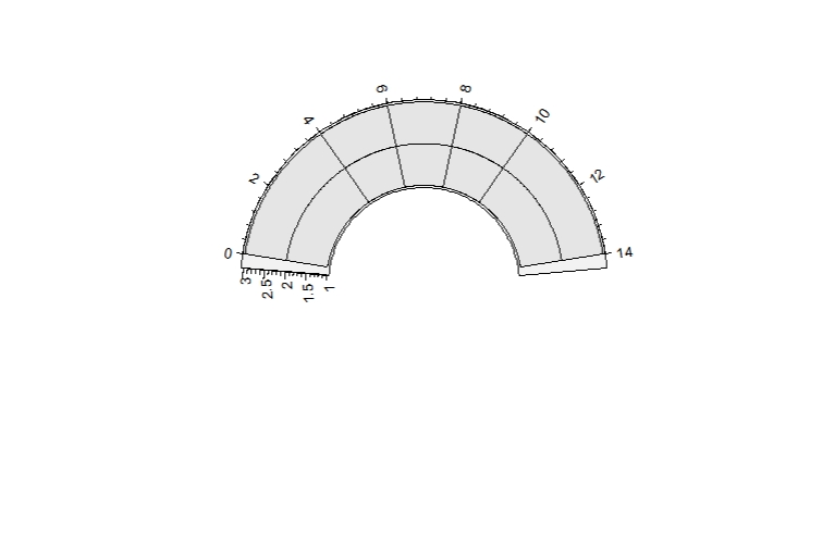
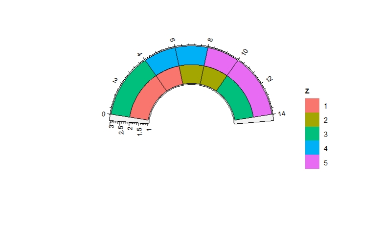
geom_arcrect draws rectangle like geom_rect.
df <- data.frame(
  x = rep(c(2, 5, 7, 9, 12), 2),
  y = rep(c(1, 2), each = 5),
  z = factor(rep(1:5, each = 2)),
  w = rep(diff(c(0, 4, 6, 8, 10, 14)), 2)
)

df <- df %>% mutate(xmin = x - w / 2, xmax = x + w / 2, ymin = y, ymax = y + 1)

ggplot(df, aes(xmin = xmin, xmax = xmax, ymin = ymin, ymax = ymax)) +
  geom_rect(aes(fill = z), colour = "grey50")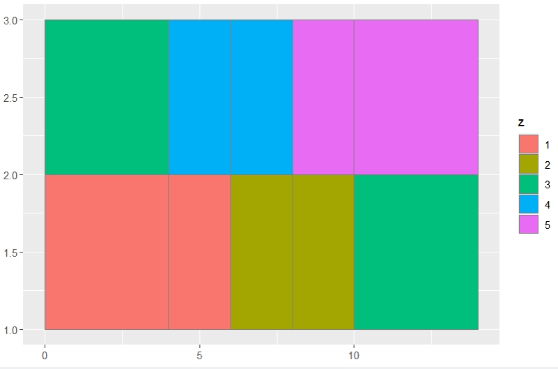
Mapping with color:
3.7 geom_arctile
geom_arctile draws rectangle like geom_tile.
data(USArrests)

mat <- scale(USArrests)
mat.long <- reshape2::melt(mat)

ggplot(mat.long,aes(x = Var1,y = Var2,fill = value)) +
  geom_tile() +
  scale_fill_gradient2(low = "green",mid = "black",high = "red",midpoint = 0) +
  theme(axis.text.x = element_text(angle = 90,hjust = 1,vjust = 0.5))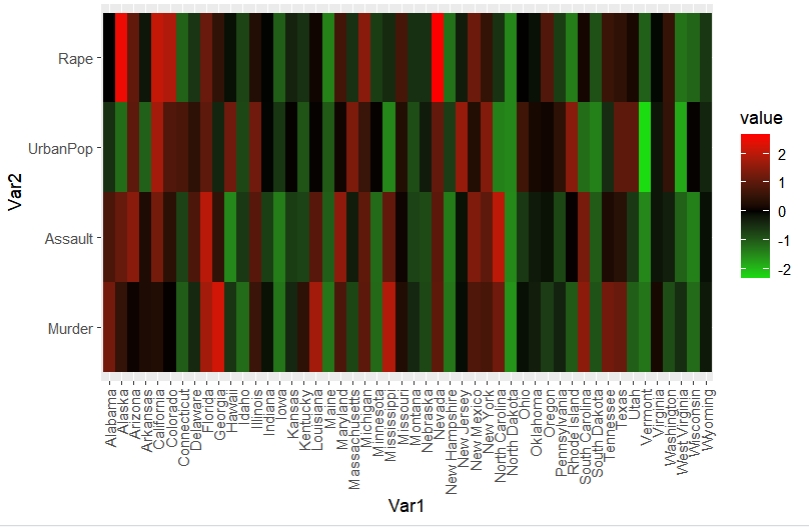
ggcirclize(mat.long,aes(x = Var1,y = Var2,fill = value),mg.t = 2.5) +
  geom_arctile() +
  scale_fill_gradient2(low = "green",mid = "black",high = "red",midpoint = 0)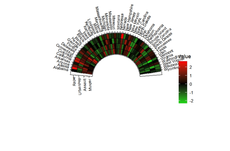
Adjust the width and height:
ggcirclize(mat.long,aes(x = Var1,y = Var2,fill = value)) +
  geom_arctile(width = 0.5,height = 0.5) +
  scale_fill_gradient2(low = "green",mid = "black",high = "red",midpoint = 0)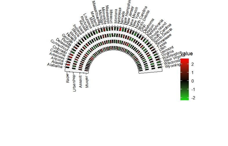
3.9 geom_arccol
geom_arccol draws barplot like geom_col.
df2 <- data.frame(supp=rep(c("VC", "OJ"), each=3),
                  dose=rep(c("D0.5", "D1", "D2"),2),
                  len=c(6.8, 15, 33, 4.2, 10, 29.5))

ggplot(df2, aes(x = dose, y = len)) +
  geom_col(aes(fill = supp), position = position_stack())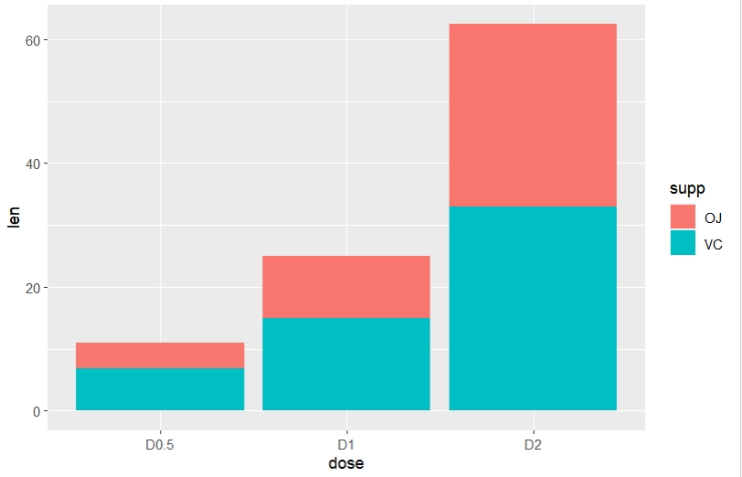
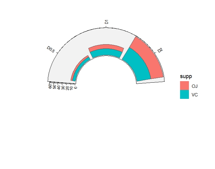
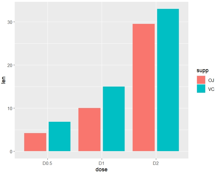
ggcirclize(df2,aes(x = dose, y = len)) +
  geom_arccol(aes(fill = supp), position = position_dodge2())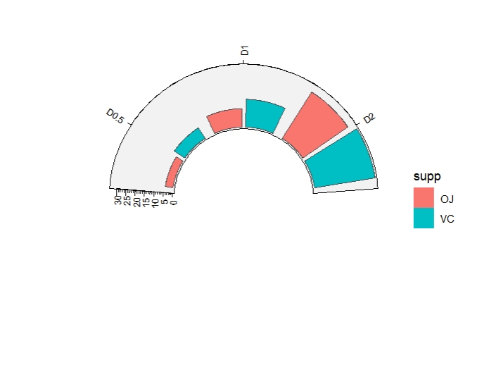
3.10 geom_arcribbon
geom_arcribbon draws a y interval like geom_ribbon.
huron <- data.frame(year = 1875:1972, level = as.vector(LakeHuron))
huron$g <- sample(letters[1:3],98,replace = T)

ggplot(huron, aes(year)) +
  geom_ribbon(aes(ymin = level - 1, ymax = level + 1), fill = "grey70")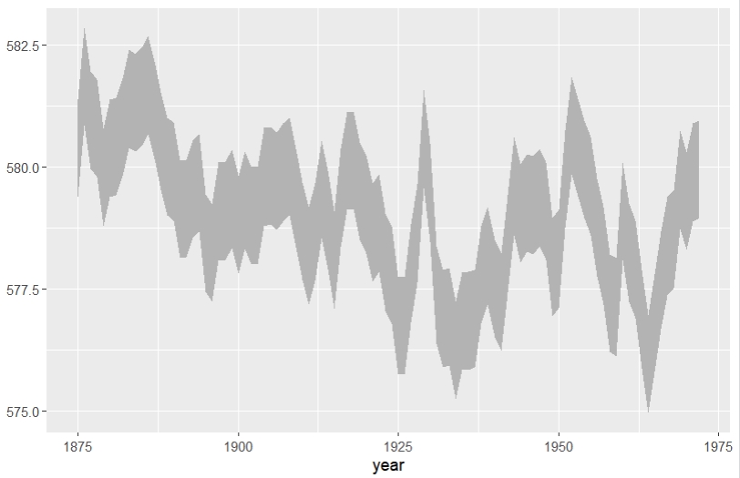
ggcirclize(huron, aes(x = year)) +
  geom_arcribbon(aes(ymin = level - 1, ymax = level + 1), fill = "grey70")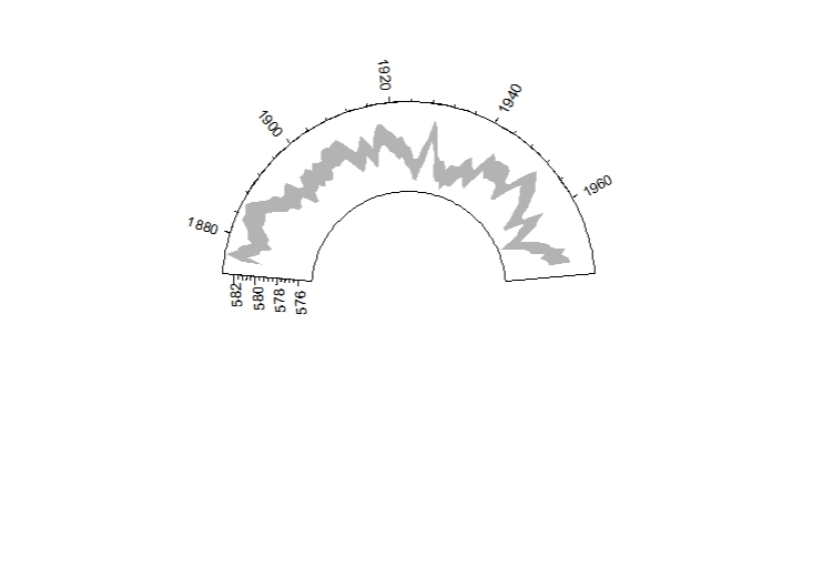
3.11 geom_arcviolin
geom_arcviolin draws violin plot like geom_violin.
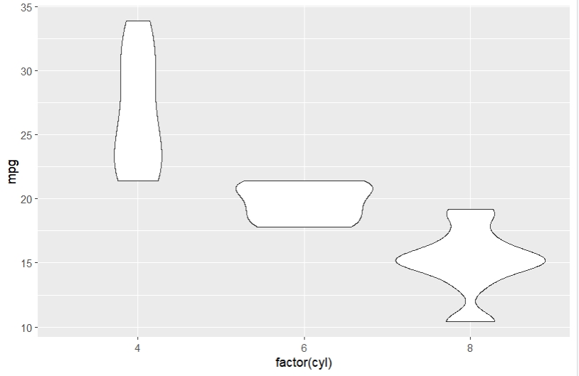
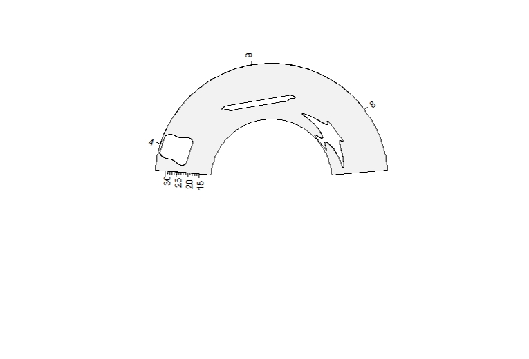
Horizontal violin:
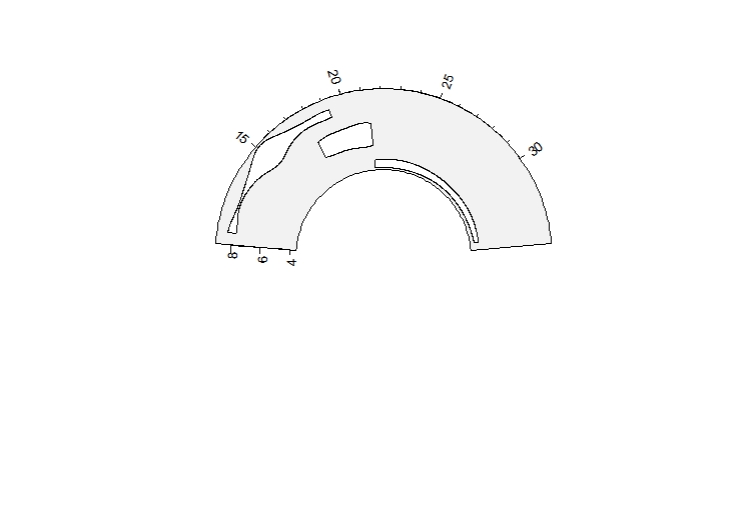 Turn off trim:
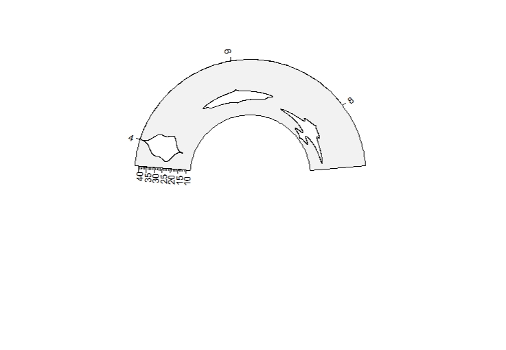
Mapping with color:
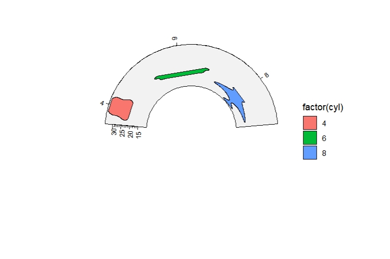
Multiple groups:
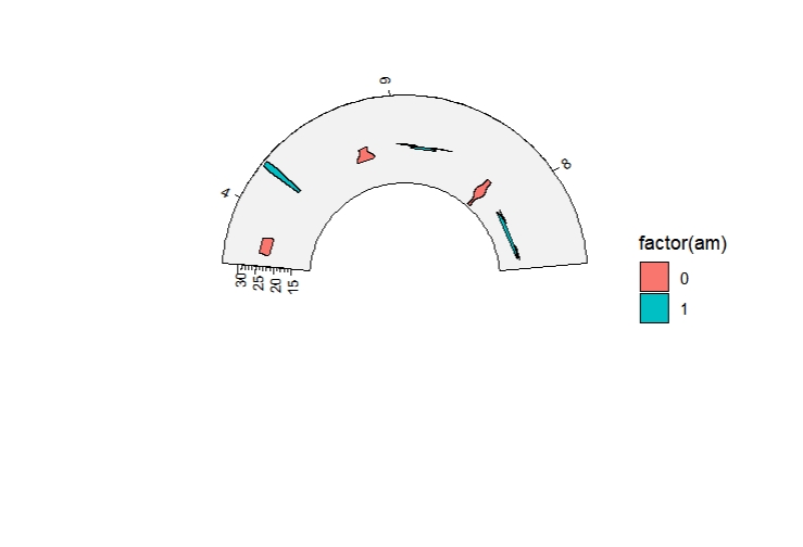
Draw quantiles:
ggcirclize(mtcars, aes(factor(cyl), mpg)) +
geom_arcviolin(draw_quantiles = c(0.25, 0.5, 0.75),
polar.every = T)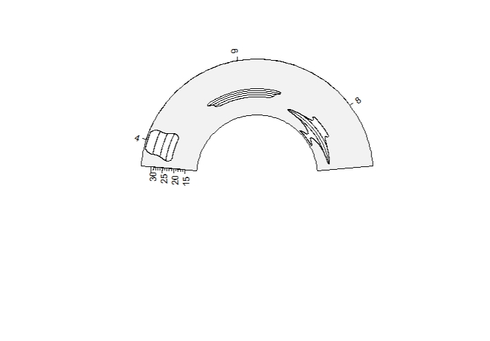 Multiple violins:
dbox <- data.frame(x = rep(LETTERS[1:26],50),
                   y = rnorm(50*26))

ggcirclize(dbox, aes(x, y,start = 0,end = 360)) +
  geom_arcviolin(aes(r0 = 0.55,r1 = 0.75),
                 draw_quantiles = c(0.25, 0.5, 0.75),
                 show.legend = F)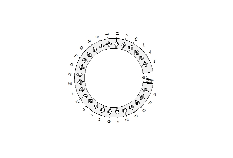
3.12 geom_arcboxplot
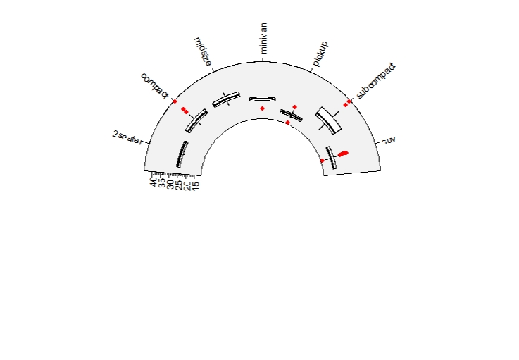
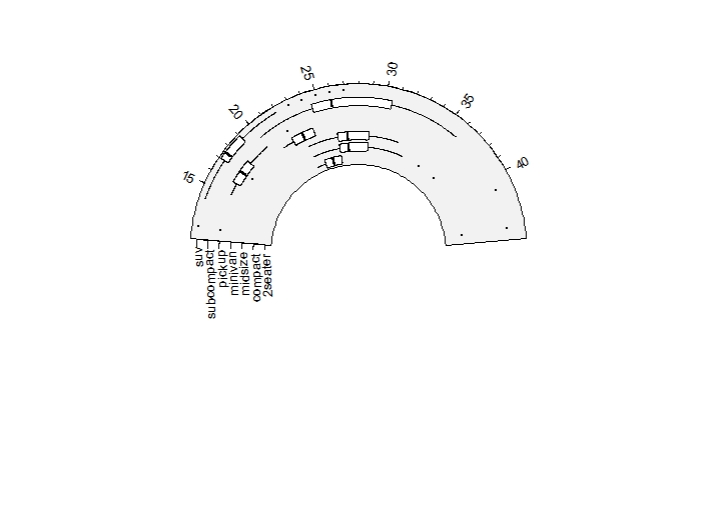
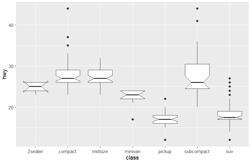
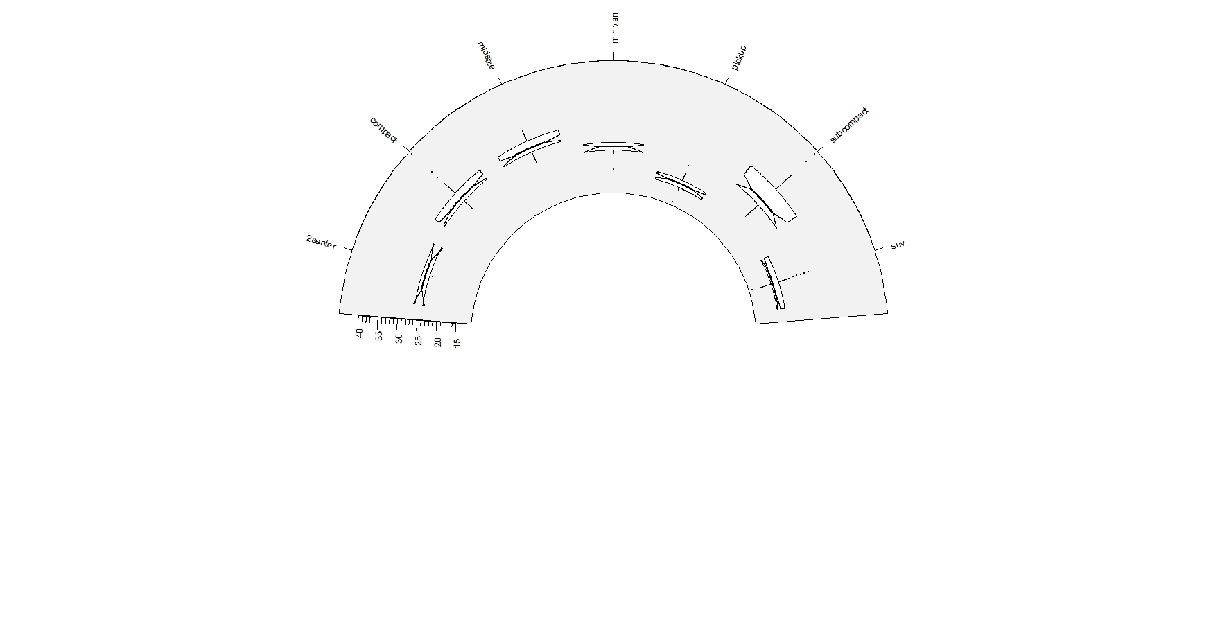
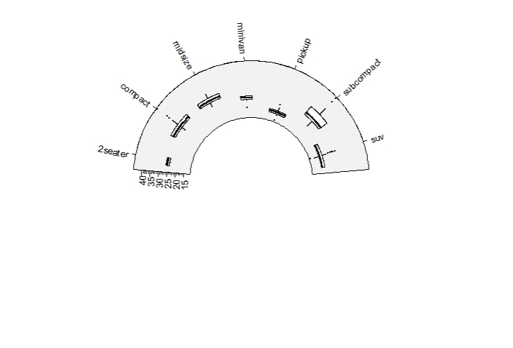
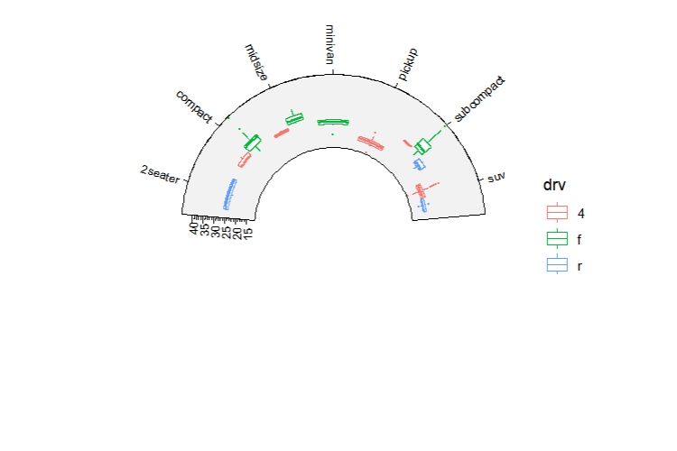
geom_arcboxplot draws boxplot like geom_boxplot.
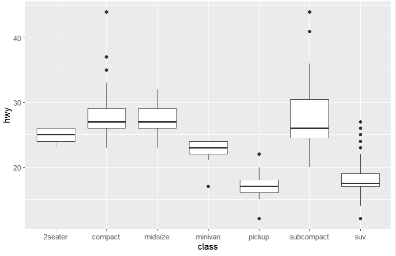
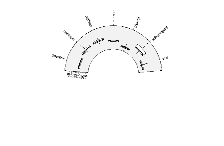
Change the outlier point graphic settings:
Horizontal boxplot:
Add notch:
Multiple groups:
3.13 geom_arcarea
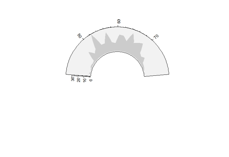
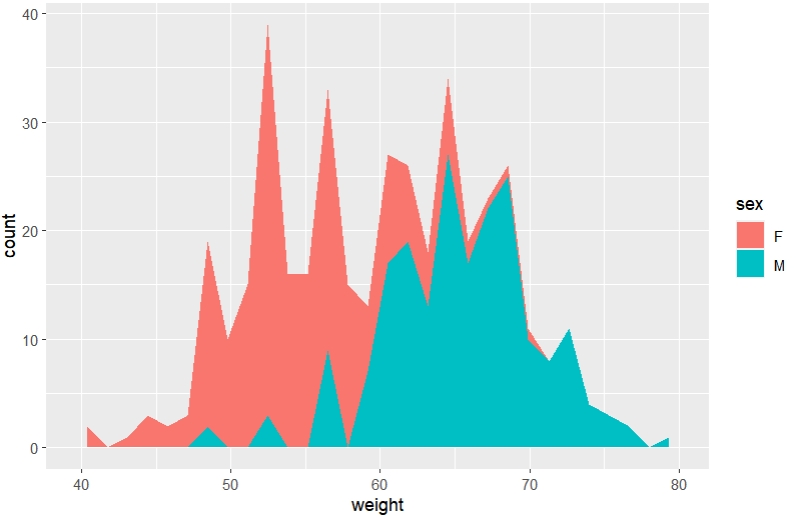
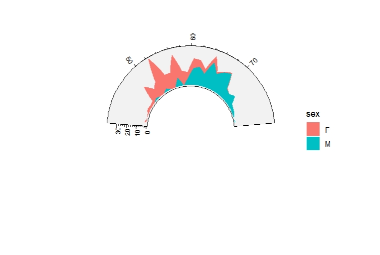
geom_arcarea draws a y interval like geom_area.
set.seed(1234)
df <- data.frame(
  sex=factor(rep(c("F", "M"), each=200)),
  weight=round(c(rnorm(200, mean=55, sd=5),
                 rnorm(200, mean=65, sd=5)))
)

ggplot(df, aes(x=weight)) +
  geom_area(stat = "bin")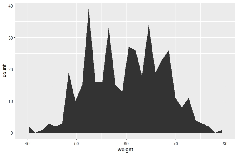
 Multiple groups:
3.14 geom_arcdensity
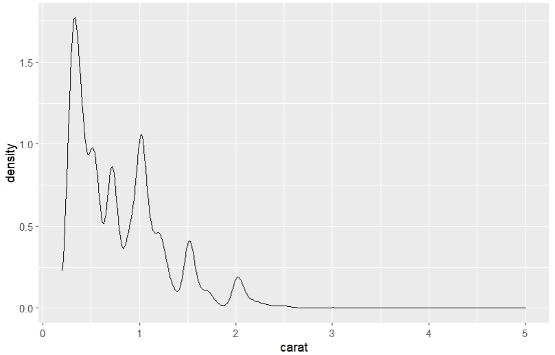
geom_arcdensity draws kernel density estimate like geom_density.
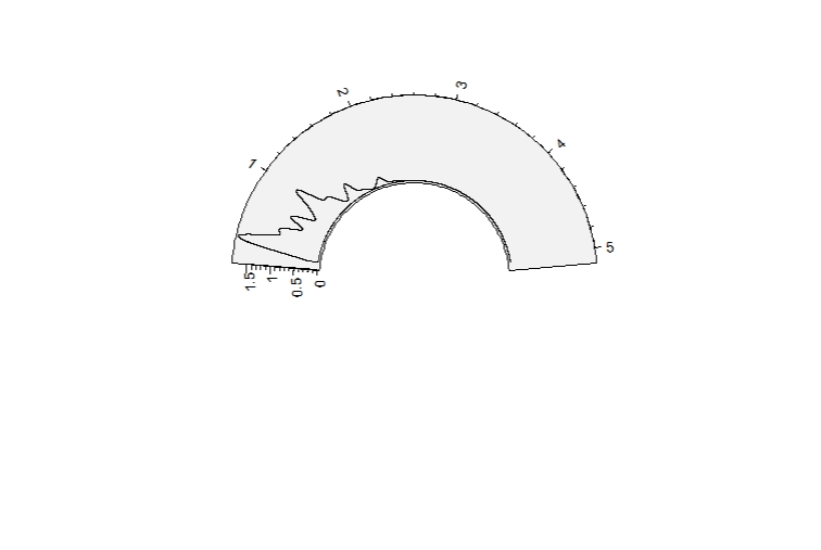
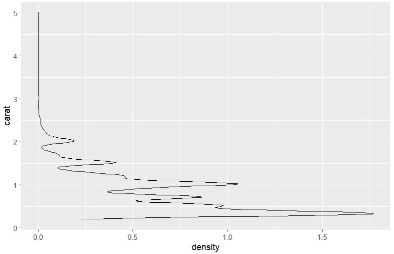
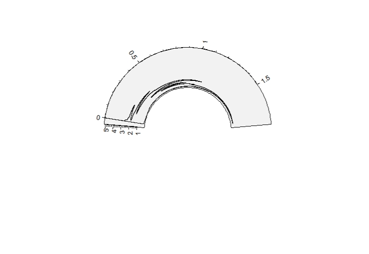
Mapping with color:
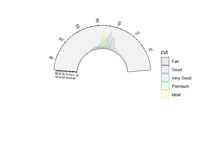
Different position mode:
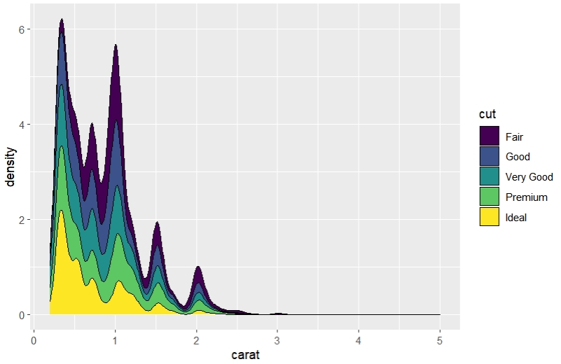
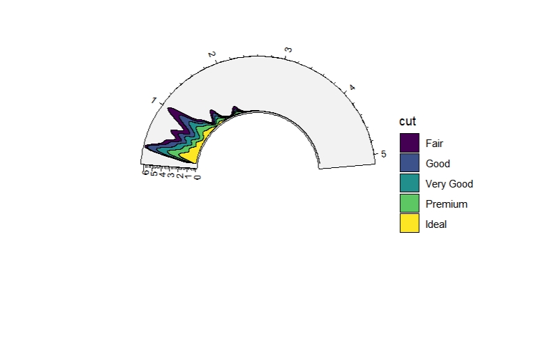
ggcirclize(diamonds, aes(carat, after_stat(count), fill = cut)) +
  geom_arcdensity(position = "fill")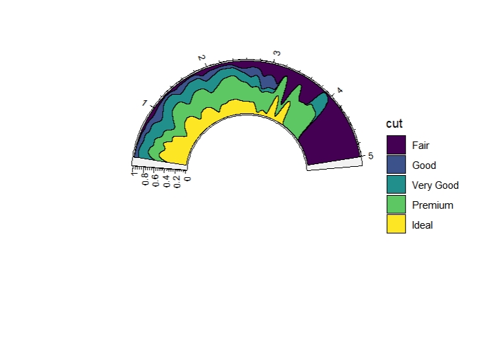
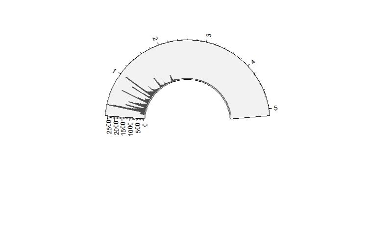
3.15 geom_archistogram
geom_archistogram draws frequency polygons like geom_histogram.
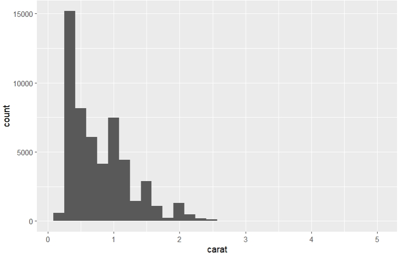
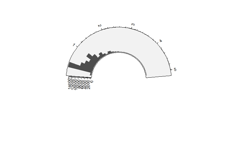
Change the binwidth:
3.16 geom_arctext
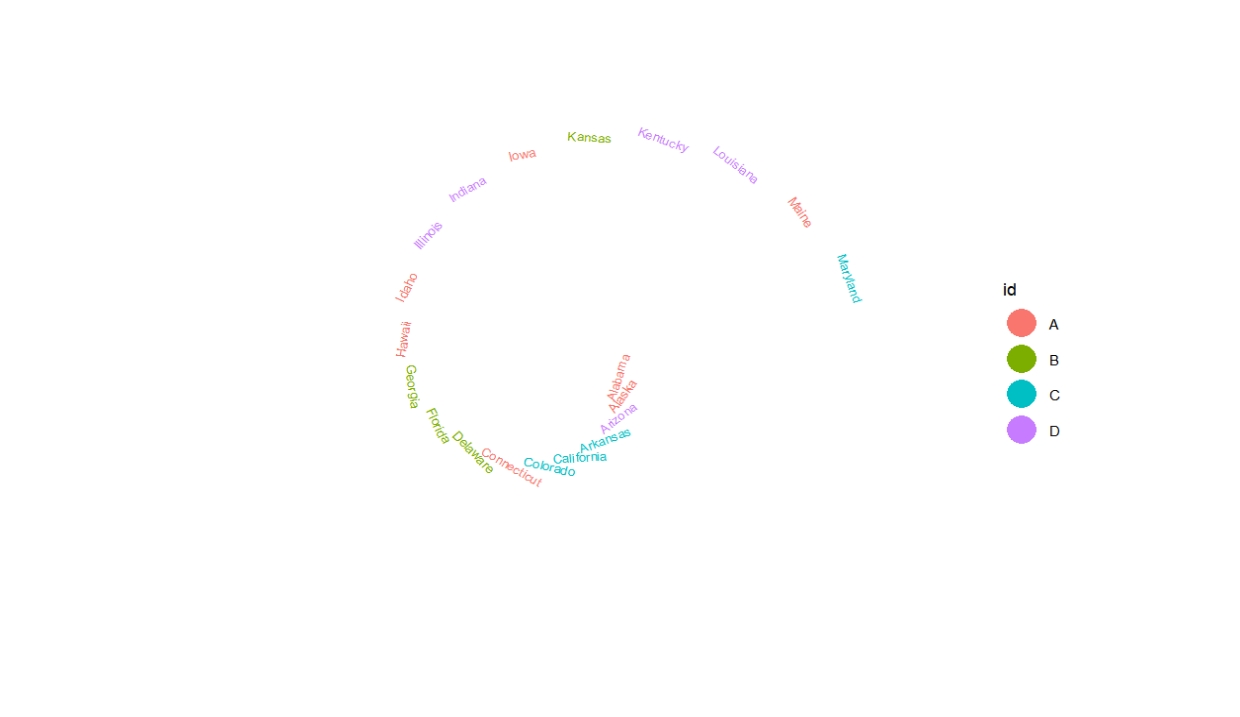
geom_arctext draws arc text in unit circle.
df <- data.frame(x = 1:20,y = 1,y1 = 1:20,id = sample(LETTERS[1:4],20,replace = T),
                 label = rownames(USArrests)[1:20])

ggcirclize(df, aes(x, y, label = label)) +
  geom_arctext(aes(r0 = 1,end = 360))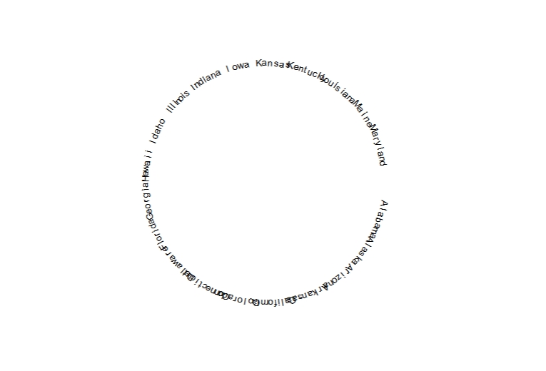
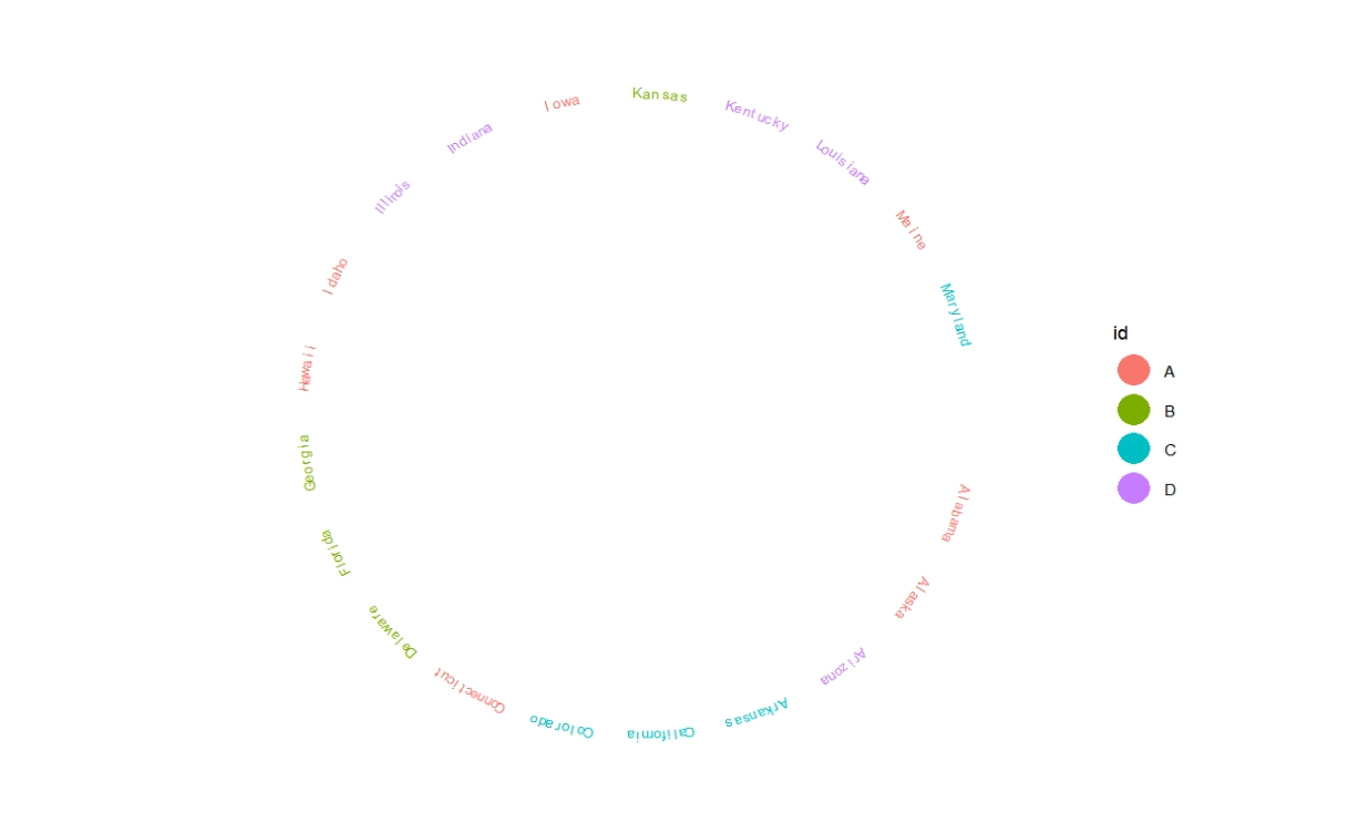
Change curved.label=FALSE:
ggcirclize(df, aes(x, y, label = label)) +
  geom_arctext(aes(r0 = 1,end = 360,color = id),
               curved.label = F)